Want to design a successful package? You’ll need to answer some important questions first. If you can answer them you’re golden. The catch: Some of these questions are moving targets.
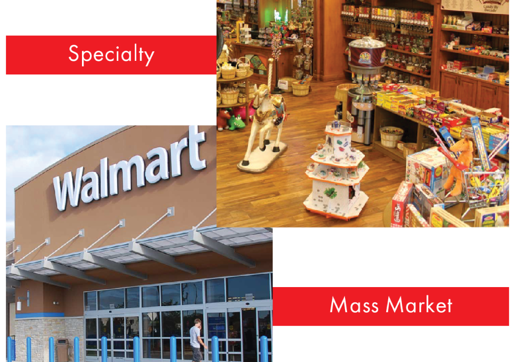
What makes a package made for mass market vs. specialty?
The simplest way to answer this is to understand the difference between a mass market retailer’s approach to selling an item vs. a specialty retailer’s way of selling the same item.
The mass market is massive. Packages sit side by side, row above row in an over-stimulating ocean of staple products, lost leaders, trending products, and markdowns. The non-promoted products are left to speak for themselves or die a fast retail death. Mass-market packaging must tell a quick, clear and concise message; If your package doesn’t tell the story in a snap of the fingers, consumers will often pass right over it. It needs to stand out.
Specialty, we’d all like to think of as our neighborhood pond. By scale there is a massive difference between a 2,500-square-foot strip mall store and a free-standing 100,000-square-foot big-box retailer. But, just because there are less fish in that specialty pond doesn’t mean you can let your design guard down. No matter what the size of the body of water, there will always be bigger fish trying to eat you. What makes specialty such an interesting design environment is the way it supports product. The specialty market tends to educate its consumers, by engaging potential customers in conversations to help steer them to the right product fit for them. Retailers will demo and display products. Some will support products in newsletters and blogs. They will champion a product and drive new trends.
So what does this have to do with design? Shouldn’t one box design fit all? The answer could be yes, but consider how sales are made in specialty and you’ll see the difference. Specialty tends to connect to the consumer with a one-on-one pitch approach to sales. They trend toward packaging that is slightly less garish and instant message-oriented to the more sleek, subtle and sexy. The package artwork, to them, is a conversation starter rather than the entire sales campaign. While you still need to make the product’s use evident, you should leave room for the retailers to tell the story in their own words.
What and how much copy should go on the front vs. the back of a package?
This is a common question I get, and, for that, I have a stock answer. I liken packaging to the way people gravitate to one another. The front of the package is the way people look. From afar, it can tell a quick story of how smart and sophisticated they are or give an impression of being silly, goofy, or even aloof. The attractiveness of the package, as with a person, draws you in to engage with the product. This should be done in a clean, concise way that projects the essence of the product. On the front, images are more important than words. Copy should be clean, easy to read from afar, and not at all distracting. Any visual clues that can say “look at me” should be engaged. The front tells the story in an instant, a moment of attraction. The back of the package is the brains and personality of the person/product. Imagine the back as a first conversation. This is the moment when you’ll find out just how sophisticated, goofy, or aloof that person/product can be. If you can balance the looks with the brains, you’ll have a successful package.
How do you determine package sizing for a retail planogram?
A planogram is the method by which retailers determine where products will be placed on a shelf or a display to optimize and increase customer purchases. It’s how they figure out which product goes where. Since there is a method to the madness of placing items on a shelf or an end cap, you need to be aware of how your package will fit into their overall plan. For this reason, most packaging categories are modular. If a retailer wants to know if your product is under-performing, it can swap it out without having to re-layout the entire shelf. How the hell do you figure out the sizing? If you can’t get the guidelines from the retailer directly, then walk some retail shelves with a ruler. Measure your competitor’s items. If you’re lucky, the retailer will replace those items with yours.
What are some common mistakes to avoid when designing a package?
While I see mistakes on the retail landscape all the time, there are three that could have easily been avoided if the designers had a packaging background to begin with.
- Monochromatic Layouts: Far too often, when I’m speaking on packaging at trade shows, start-up companies with great products come to me confused as to why they have such poor sales. Many times they have some very thought-out, asthetically pleasing monochromatic packaging. My first question is “From what design discipline does your designer come from?” The answer is almost always print or web design. The potential problem with that is unlike with print and web design, consumers picking up your package at retail are not a captured audience. By making your packaging monochromatic you are camouflaging your product on shelf. You need to make sure the right elements pop off the package. Using 10 shades of the same blue won’t achieve this effect.
- Poorly Spaced Type: Too often designers think that making a font large and bold constitutes a logo. While I will confess that on occasion it can work, nothing drives me crazier than a designer who doesn’t know how to properly space letters. There needs to be a spatial relationship that will balance things out. This is a Design Edge staple. We teach our interns to imagine a small ball that needs to travel within the negative space between the letters and in a channel that is a perfect size for that ball. It is then their job, as the designer, to make sure that ball can travel perfectly between the letters without getting stuck or having too much space on either side.
- Overly Attractive Layouts that Tell No Story: I see this a lot when designers over-aim for the specialty market. They make gorgeous layouts that don’t tell you diddlysquat about the product. For the designer, it can be a proud centerpiece for their portfolio. For the manufacturer, it can be a disaster with thousands of pieces in dead inventory. These packages are basically really attractive people with no brains.

If you’re having a hard time conveying a message on the package or have limited real estate or production requirements, I suggest you roll with the Steve Buscemi (pictured) approach to packaging. You may know him from HBO’s Boardwalk Empire, The Sopranos or Quentin Tarantino’s Reservoir Dogs. He is so ugly in a unique way that he is attractive. Don’t get hung up making your package sexy, make it “Buscemi.” The odd-looking package that stands out in stores full of sexy packages.

Matt Nuccio is president of Design Edge, a New York-based graphic design and research development studio. For more information, he can be reached at matt@designedge.net.